I love the Designer Series Papers from Stampin' Up! but sometimes they are not quite what I want for a particular project, so today I thought I would show you how you can easily change the look of your Designer Series Papers.
For these two examples I am going to show you are using the wonderful Beyond the Garden Designer Series Papers (which you could earn for free this month - just ask me how!).
I love how vibrant and funky they are, but for these two projects I wanted to match them with other colours and to soften their looks. The same technique would also work to add vibrancy to a soft coloured paper.
I love how vibrant and funky they are, but for these two projects I wanted to match them with other colours and to soften their looks. The same technique would also work to add vibrancy to a soft coloured paper.
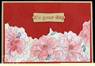
Firstly I took the sheet of paper with large white flowers outlined in Pacific Point. I wanted to use the papers on a River Rock and Ridinghood Red Card so needed to tie them in somehow. So I coloured the flowers using reinkers and a waterbrush. Here it is part way through the process
and here is the finished card
Then I took the Wild Wasabi Sheet with the white flowers and leaves outlined in Pacific Point. It was the paper I used on this Butterfly Card I showed you earlier this week.
I coloured the white spaces using my Watercolour Wonder Crayons in Pretty in Pink and Wild Wasabi.
This totally changed the feel of the papers and made it suitable to use on this card.
So next time you want to change the look of your Designer Patterned Papers why not get colouring?


No comments:
Post a Comment